 Schuyler, the Virginia-based “rookie” Bible publisher, pushed the industry envelope in 2014 with the release of their Quentel NASB Bible. This was to be the first in a new line of reference Bibles, and by all accounts it was a smashing success with soaring promise for future installments. J. Mark Bertrand of The Bible Design Blog called the NASB Quentel “a triumph.” I didn’t pursue the Quentel NASB, but with all of the hype and anticipation I decided to jump aboard the bandwagon and assess the second installment of the series, the Quentel ESV (henceforth ESVQ). Here’s a note from the publisher:
Schuyler Bibles has had one simple mission – to produce Bibles whose quality extends to both Printing and Binding. Often customers are forced to choose between the two. We decided to produce Bibles with the best of both worlds. Paper quality, legibility and binding come together to produce the best crafted Bibles available.
Well said, and true to life for Schuyler’s work thus far. I reviewed the Schuyler ESV New Classic Reference edition here, and I was impressed. But that was nothing compared to the ESVQ. In fact, I can’t quite contain myself ’til the end, so here is my ESVQ spoiler: I have never seen a Bible quite so understated yet beautiful, simple yet innovative. This design, possibly more than any other I’ve seen, gets out of the way and provides the reader a window into the text itself. But I’m getting ahead of myself, so here we go…


Externals
This ESVQ is wrapped in a thick goatskin and available in Antique Marble, Dark Green, Imperial Blue, Firebrick Red, and plain ‘ole Black for the traditionalists among us. I’m reviewing the first two, and let me tell you, they’re stunning.


The Antique Marble is on the lighter end of the brown spectrum, perhaps halfway between Crossway’s “deep brown” and Allan’s caramel tan color. I would be hard pressed to imagine a better brown than this. Also, in keeping with its moniker “Antique Marble”, you can see slight flecks of a darker shade (black? brown?), but only if you look extremely close. The effect is fantastic–I don’t think there’s a better color option among the ESVQ‘s. And the gold ribbons match the gold gilt and the gold spine embossing, contrasting slightly with the brown cover and adding a level of beauty and class that no other ribbon color could offer.

 The Dark Green could also be accurately described as “forest.” It is a beautiful shade, particularly when paired with the gold gilt, brown liner, and the three ribbons in slightly different shades of gold. While the green is beautiful, I’m not a “green Bible” kinda guy (perhaps because I’m Minnesotan, and Green Bay is “the enemy”). But if you’re Irish, or if you like Hobbits (like me) or Green Bay Packers (like not-me), or if you just like green, then you’ll be very pleased with the Dark Green. J. Mark Bertrand comments, “If you want a cover that’s out of the ordinary but will still pass as sober and austere from a distance, dark green fits the bill.” One note on the leathers: They feel the same and share the same brown liner, but the grain on the Antique Marble is a more pronounced, large, round pebble grain than the Dark Green, which is a subtler and finer pebble grain.

In my write up of a rebinding project by Leonard’s Books, I lauded hobbit-esque Bibles. Well, I think both of these ESVQ colors would be acceptable in the Middle-earth legendarium as well. And notice how the browns compare:


The goatskin itself is thick and leather-lined on the inside. It reminds me quite a bit of Crossway’s Heirloom line, actually. I wasn’t able to confirm whether its the case, but I suspect it is the same vegetable tanned goatskin. The interior liner looks and feels identical to Crossway’s (which was bonded leather). In any case, it is thick, strong, beautiful leather. If you’re familiar with Allan’s highland goatskin, this is not nearly as limp and flexible a cover, but that is not necessarily a bad thing, especially considering the bulk of this text block. I love this goatskin, and I’m not sure I would have it any other way on the Quentel.


The binding is smythe-sewn, of course, and hence flexible and long lasting. And the block is attached to the cover using edge-lining rather than pasted-down end pages, also adding to the lifespan and flexibility of the Bible. I must note that, as with Crossway’s Jongbloed-bound Bibles, and even Allan’s NASBR1 and a few Cambridge Bibles, this one has fairly large and stiff hinges where the cover connects to the text bock.


Again, particularly with a large book like this, such hinges probably mean increased longevity. However, they also mean decreased flexibility, especially in the ESVQ‘s infancy. I don’t mind, though, as I am quite confident it will break in nicely as I “bring it up by hand”, just like Pip! (Thats my first and last Dickens reference in this review–2 points if you can name the book). And as long as we’re on the topic of “infancy”, some people have complained that these hinges squeak, like “baby elephants”. I can corroborate that there is some slight noise, but I do not find it bothersome. These are really “first world problems”…Come on, guys!
Since you asked, the dimensions are 9.1″ x 6.1″ x 1.75”, making this a bulky Bible. However, I do not find it unmanageably so. It is larger than a typical reference Bible, but smaller than a typical study Bible. Check out the size comparisons:


As for the bells and whistles we look for in high end Bibles, the ESVQ features art gilt. The ESVQ features a gold gilt line. The ESVQ features three ribbon markers (thick and long!). And the ESVQ features a blind stamped Jerusalem Cross on the cover, Schuyler’s logo. Very classy indeed.

J. Mark Bertrand said that the cover curves away from the text block when opened. On my green one, it does so. But on the brown, the cover tends to curve in with the spine if I put any pressure on it. And all of evangelicalbible.com’s photos seem to demonstrate an inward-curving spine. Not necessarily something bad, but just be aware of the variation.

Internals
While the outside is just “extremely nice”, the inside of this Bible is out of this world, owing the the nearly perfect marriage of excellent paper and excellent typesetting. Thank you, Schuyler and 2K/Denmark! It is difficult to contain in words just how extraordinary this text block is, but I must at least try.

The paper is 38 GSM Tervakoski Thinopaque paper with 84% opacity rating, which means that it is arguably more opaque than any other Bible paper in circulation. Does it mean that there is no show through (or ghosting) at all? No; after all, Bible paper is Bible paper, whatever the label. But I can say that the ghosting on this one is substantially less noticeable than on any other Bible on my shelf, comparable to the Cambridge Wide Margin which also features this paper (more on the ghosting below). I bet this will handle ink famously. When I turn through the pages, I can definitely feel the added thickness, and I am more confident in this paper’s ability to resist wear and tear than my 28 GSM Heirloom ESVs or Cambridge Clarion.


Add to the fantastic paper a fantastic typesetting and the result is magic. The ESVQ is printed with a 11 point Milo serif font, which has taught me that not all fonts are equal. If you compare this 11pt Milo to the Allan ESVNC1’s 10pt Lexicon, the former dwarfs the latter. If you were using the ESVNC1 font as the baseline, the ESVQ font would be closer to 12 or 13 point, probably. In other words, to get the ESVNC1’s 10pt font to look as big as the ESVQ‘s 11pt, you would have to jump 2 or 3 sizes, not just 1. If you are old, or read from a pulpit, or otherwise appreciate large print, you have to check this Bible out. I am not old, nor do I often read from a pulpit. I mostly read in an armchair, but even so I have yet to find a font that is easier on the eyes than this Milo 11pt. It is a simple and crisply printed typeface, resulting in an eminently readable Bible.
The following gallery compares and contrasts the readability of the ESVQ to the Allan ESVNC1, Crossway Heirloom Wide Margin, Heirloom Legacy, and Cambridge Wide Margin. I intentionally chose poetry sections because thats where ghosting is the worst:


The magic of the ESVQ‘s typesetting doesn’t end with the stellar font, though. As if the 38 GSM paper wasn’t enough to mitigate ghosting, the line matching seals the deal. In fact, I would say that the paper puts the “ghost” in jail, but the line matching banishes it to the abyss (I love overstatements!). Of course, when there is blank white paper, such as in poetry, you definitely still see it, but less so than in other Bibles.

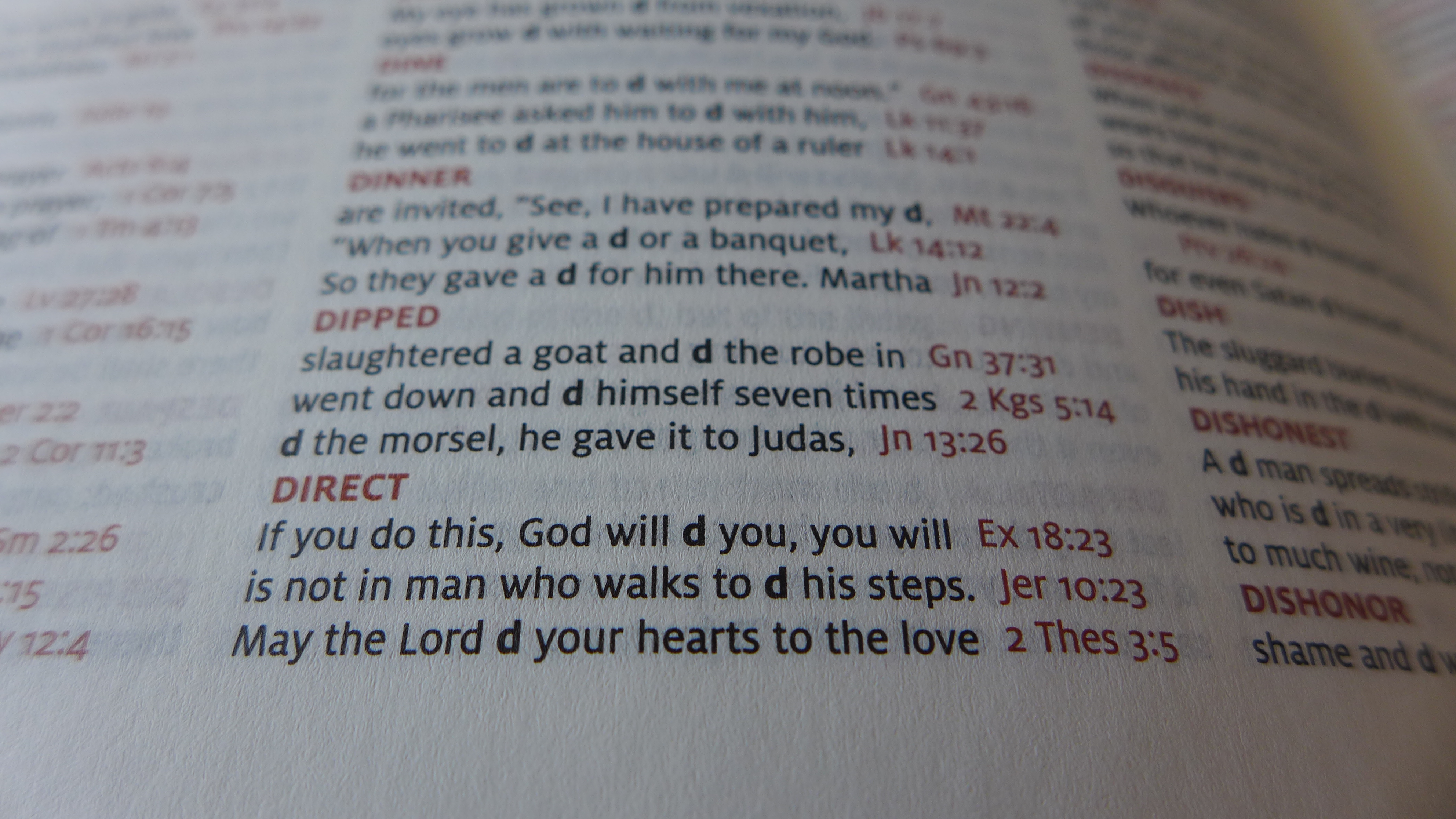
Finally, the ESVQ‘s typesetting has some subtle-and-smart touches that increase its beauty and readability without you even really noticing (and that is probably the best compliment one can pay a Bible’s design). For one, the cross references are placed on the bottom of the page so that they don’t crowd the text. This is a judicious move, and one that many have appreciated. And, as mentioned, the references are in red, making it supremely easy to navigate the 80,000+ cross-references. The translation notes are placed on the outside column at the bottom. Also, chapter numbers and references in the footnotes are printed in a bold red font, as are the contents of the header. One could overdo red, but the ESVQ‘s use of red is subtle, helpful, and beautiful.
Allan or Schuyler?

Some of you will wonder how the ESVQ compares to the Allan ESV New Classic (NC1). Most will agree when I suggest that these are two of the finest editions of the ESV in print, if not the finest. And it is doubtless that these are the best double-column, large print reference ESVs in print. So here’s my assessment: the Allan NC1 wins on the outside, and the Schuyler ESVQ wins on the inside. So maybe it’s a wash. But at the risk of a false dichotomy, what is really more important when it comes to a Bible– the outside or the inside? (See how I’ve cornered you 🙂 ?) Allow this comparative table to help you choose between what are two incredible options:
| Schuyler | Allan | |
| Extreme Suppleness | X | |
| Lays 100% Flat | X | |
| Portability / Weight | X | |
| Yapp | X | |
| Wild Grain | X | |
| Lined Note Pages | X | |
| Opacity | X | |
| Font Size | X | |
| Line Matching | X | |
| Crisp Printing | X | |
| Innovative typesetting | X | |
| Ample Margin Space | X |
The Allan gets more checked boxes, but even in my subjective categorization that doesn’t mean it wins. Your preferences will cause you to weight the boxes differently. The inside of the Schuyler is indisputably better in every way, except for the margin space. And again, whats more important in a Bible than the inside? Also, let me clarify: The ESVQ is no loser on the outside just because it doesn’t quite measure up to the Allan’s outside. So which one wins the gold medal for ESV double-column reference Bibles? The two are both fantastic, and I’m pretty torn. But…I actually find myself leaning toward the ESVQ …an outcome I did not expect when we were waiting for its release. Time will tell which I prefer. Here are a few more comparison photos, and you can decide what you think more attractive and more readable:


Conclusion
Cambridge has published Bibles since 1583, and R. L. Allan & Son since 1863. These are really the only other companies that compare to Schuyler in the scope and variety of Bible and translation offerings. And guess how long Schuyler has been in the neighborhood? Only seven years! Yet in seven years time, they have managed to publish Bibles that at least compare–or arguably rival–the best Cambridge and Allan have to offer.
That was all before the Quentel. But now, with the Quentel line, I believe they have led Bible publishing into a new season, and in so doing, they have taken the helm from the hands of their older brothers. In an era when most publishers are compromising readability in favor of small size, Schuyler has done the unthinkable: they have listened to the consumers, and we’re saying, “I’m okay with a bigger Bible if it means better legibility.” I hope other publishers will follow in suit.

With the ESVQ, the design gets out of the way and lets you see the text more clearly than any other Bible I’ve yet seen, which is just what a design should do. How does it accomplish this? Line matching, large and readable font, opaque and thick paper, understated use of red color, and smart layout. Combine that with a fine cover and durable binding and you may just have the best ESV on the market to date. Bravo, Schuyler. We will look forward to your future with great interest.
Buy it here. Read more here, here, and here.
And lest we get lost in leather-bound English-Bible luxury, please remember to pray for translations in the remaining 1,859 Bible-less languages in our world. Click here to see my heart on the matter and to even support the work of Bible translation.


Here’s a gallery of “throw away” photos I decided to hang onto:


Great review, thanks for sharing your thoughts and photos of this great looking Bible.
Thanks Norm. My pleasure
I concur. I have the green and its sublime. Fantastic review.
Great comparison!
Can you confirm if the Allan here has red letters (Jesus’ words)? I can’t find anywhere that clarifies that. Thanks!
Thanks for asking, Matt. The words of Christ are in black in both the Allan ESVNC1 and the Schuyler Quentel.
Both of these bibles are well made and I agree with your comparison table. I own bibles from both Schuyler and R.L. Allan and they are excellent! Unfortunately the Schuyler Quentel is just too thick (as a reference bible) for my taste.
Let me also digress for a moment. I do not understand why publishers still gravitate toward the double column setting. If the Quentel was a single column setting, and a tad thinner I would buy one of the ESV’s and one of the NASB’s in a heartbeat. Right now the only high quality ESV in the SCR category is the Crossway Heirloom Legacy (which I also own). Unfortunately the thin 28gsm paper makes it unsuitable to take notes in and the ghosting is noticeable. Now that the Allan ESVSCR1 is no longer available there isn’t much to choose from. I think at this point I will wait for R.L. Allan to produce the Personal Reference ESVSCR in late 2015.
Thanks for commenting! I hear what you’re saying. I was all about single column paragraphed Bibles for a long time (and I think it maybe was J. Mark Bertrand whispering in my ear!). I see the merit of such typesettings from a philosophical standpoint, but in all honesty, I think that double column Bibles are also very readable. And to me, they’re more versatile in the sense that they’re easier to teach and preach from (you don’t have as huge a block of text to find your place in). So I love the NCR and Quentel, my favorite two ESVs on the market. As for the Heirloom Legacy, its not a SCR because there are no references, but the Clarion is a fine SCR. It also suffers from the thin 28gsm paper, though. Allan and evangelicalbible are sold out of the Allan ESVSCR, as you mentioned, but that was the 2007 text and the ghosting was pretty bad (I had one). You’ll be glad to know that Allan has plans for 3 single column ESVs in the near future: Legacy (36gsm!), Verse by Verse Reference, and Personal Reference (as you mentioned). The first two have about 9pt font, while the latter has 8pt font (check out my review of Crossway’s top grain version). I’ll be tempted by all 3!
Jeffery,
Thank you for the good information. I will look for the new offerings and I appreciate your excellent reviews. You are very thorough and even handed in your approach, yet you do not shy away from criticism where it is due.
Wonderful expose! These editions look magnificent. I will likely admire them from a distance – not something within my budget, but surely a gold standard.
Great Review! I’ve seen each bible reviewed separately ad nauseum, but never together until now. Great pics and great comparison / contrast. Thank you.
Is the Antique Marble different from the Brown Marble used on the Schuyler NKJV?
Hi Jason! Evangelicalbible.com confirmed that these two are the same color.
Thanks for the review. I’ve read both yours and Mark’s, and I’m deeply torn between this Quentel and the Heirloom Legacy by Crossway. I appreciate the fine craftmanship of the Quentel, but the Legacy seems so great with the single column and the wide margins. I’m also concerned about bulk — I have a thinline rebound ESV right now, and I’d like to get something beefier to keep for years and years, but I don’t want something enormous. Can I go wrong with either of these? Is one of them a clear win over the other? Thanks!
The Quentel is definitely beefier, but I wouldn’t call it enormous (though compared to a thinline, it is). I like it better overall though due to the thicker paper, larger font, fancier looking cover, and the larger choice of colors. With the second printing, they’ve actually added 2 new colors, so there are 7 choices for the ESVQ…that tan looks pretty nice. They’ve also begun to use a calfskin liner. But if you’re more keen on having a single column, the Heirloom Legacy is definitely fantastic too (see my review on this blog).
Hi Jeffrey, thanks for your review. I am myself thinking of getting new Bible either in the NASB or ESV with great cross-referances, you know the kind of cross-referances you would expect to find in a study Bible. My current ESV I use is the Crossway Personal Size Refeance Bible Trutone (now out of print). It’s cross-referances are not as conprehensive as I thought, so during study I use my old NKJV Study Bible’s cross-references along with my ESV. But the thing is I don’t use my NKJV as my preferred translation anymore and it would be easier to just have one Bible instead of two side by side (my desk is not big enough nor is my bed a great place to study!)
What would your recommendation be for getting an referance Bible with good, conprehensive cross-referances? Preferably in the in the NASB (or ESV? And also how to get from a UK supplier?
Thanks and blessings
Josh
Hi Josh. I am hoping others weigh in here, because I’m not sure about what Bibles have the best cross-references. Personally, I use Bible software and it makes cross-references obsolete for me. The NASB typically features more cross-references (“over 95,000” opposed to the “over 80,000” on the ESV description). I don’t know if there is more or less in other reference editions of the ESV or NASB. The Westminster KJV (Schuyler and TBS) has over 200,000. As for how to get from a UK supplier, I’m assuming you’re referring to R. L. Allan? If so, their website is bibles-direct.co.uk. Otherwise, evangelicalbible.com also sells Allan Bibles in the US. I’ve bought from both with satisfaction (free shipping in both cases).
Hi Jeffrey,
Thanks for replying to my comment. It’s looks like I might be getting an NASB then, and thanks for providing the link for bible-direct.co.uk I will check them out! Thanks for your help!
Josh
An excellent, thorough review; thanks! I have the NKJV Quentel and think it’s overall the highest quality Bible I’ve ever seen. I wish it were a bit slimmer, but the quality and readability are worth it. Schuyler’s Bibles are tops both inside and out, something that can’t always be said for the other publishers.
Hi Jeffrey,
Thank you so much for the excellent detailed comparison! It was very helpful in my decision to purchase the Quentel and I appreciated how you summarized your conclusion in a simple chart (for one who is not knowledgeable in Bible construction and aesthetics – this sealed the deal!) Can’t wait for it to arrive!! I was completely sold on the Allan for the lighter weight until I honestly understood how important typesetting and paper quality is for longevity. The only concern I have on the Quentel is how words are broken apart into syllables to fit in the column (is this the result of right justification?). I find it distracting to read fluidly when words are often hyphenated. I did not see this effect in the Allan ESVNC1. Could you please explain? Thank you for your help!
Jan